The following is a collection of points related to the psychology of design based on a UX podcast I listened to as well as my reflections on my summaries of The Design of Everyday Things. I also included some critical response questions to provoke thoughts on the points, in bold.
Grade that I gave myself for this assignment: 95/100 (would’ve been a 100/100 but I posted a day – OK 2 – late)
First I listened to a podcast on the psychology of design and behavior change from the UX Podcast on Spotify called “#232 Design psychology with Amy Bucher.”
The first point from the podcast that struck me was that the role of a psychologist or behavioral economist in the context of a business can be to find the overlap in what people want for themselves and what is good for the business, as people will only continue to behave in ways that truly align to their personal goals. What is an example of a business that tries to get customers to behave in ways that benefit the business but don’t actually overlap with the customers’ interests or goals? First thing that comes to mind is 2-factor authentication because even though in theory higher security should be in the interest of users as well as businesses I’m guessing customers tend to get very frustrated at this log-in requirement and often abandon the site at that point. Another instance that comes to mind is the locked plastic barriers that cover many of the products in brand name drugstore locations that are in the middle of big cities. They aim to prevent theft of those products, obviously in the interest of the business, but they force customers to request assistance in order to view or purchase any of those products, which is hugely inconvenient and arguably not aligned with their interests or goals.
Next, a tool that was referenced in the podcast is called an outcomes map, and it’s a visualization of the changes in key metrics that designers expect to see over time if a product is successful or used as expected. Can you think of an example of an outcomes map for a product and how it would differ depending on whether the product was used correctly or not? I’m going to use a feature change (or test) I saw on Spotify recently that it seems actually (rightfully) didn’t go well and was eventually reversed. In a couple of different places on the app they removed the “Like Song” button that would add a song to a user’s “Liked Songs” list in one click, and instead they began forcing users to click “Add to Playlist” and then “Add to Liked Songs Playlist” in order to achieve the same result. I’m guessing the reason for this was to encourage the usage of playlists by merging the common user flow of liking a song with the flow of adding a song to playlists. However, this change forced users to have to perform an additional step to complete a common, highly used task, and I don’t know about anyone else but I was very annoyed by this. Anyways, back to the outcomes map:
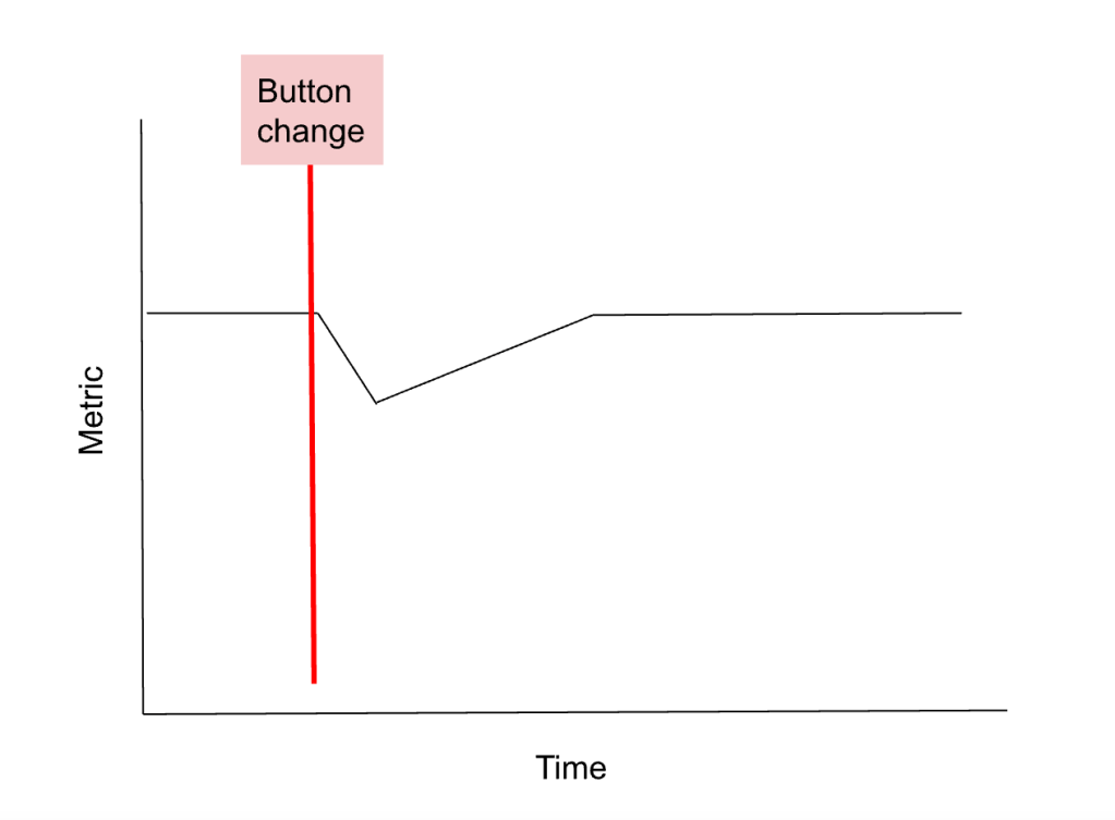
First metric I would look at is the number of songs added to Liked Songs list, which I would expect to at first go down a little due to the change in actions required, but I would expect it to go back up to normal as people adjust to the new flow:

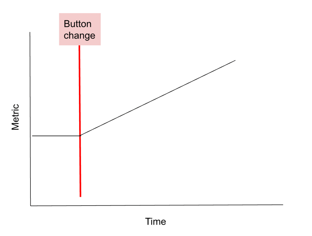
Second set of metrics I would care about is the average number of playlists & number of songs in playlists, for which I think the same outcomes map is relevant. I would expect to see an immediate, steady increase that continues steadily growing over time:

The third metric to look at is the percentage of time users listen to their own playlists vs. anything else, which is my guess of the key metric that Spotify was trying to change with this button removal. I expect that initially this metric would increase steadily, then it would slow down but continue to increase a little over time:

Using these predictive outcomes maps, I would expect that in reality the rate of adding new songs to Liked Songs didn’t recover quickly enough or fully, and the usage of playlists didn’t increase enough, indicating to Spotify that the feature change did not have the intended effect and pushing them to reverse the decision.
Another tool/framework that was introduced in this podcast was the COM-B framework, which outlines the prerequisites for action in the context of the psychology of behavior. COM-B stands for capability, opportunity, motivation, and behavior, indicating that a person must have the capability, the opportunity, and the motivation in order to enact a behavior.
The last point I took away from the podcast was the suggestion that sometimes friction is actually required or beneficial to a user experience. This is proposed in contrast to the common belief among product designers (and others) that friction should be minimized in pursuit of a seamless product experience. In the podcast they explain that friction requires people to try harder, thus giving them more of a sense of accomplishment when a task is complete. Friction can also give them some necessary time to reflect and overall make users more committed to the task. They don’t recommend complicating the initial intake or sign-up experience, but they suggest that friction later in an experience can make that aspect of the experience seem more important and worthwhile while increasing user trust in the product. Can you think of an example where a little bit of tasteful friction might help improve the user experience? Generally user experiences applicable to this strategy would be those dealing with sensitive information – health, finances, etc. Another situation that might benefit from a more frictional experience relates to college applications and admissions, which seem to have undergone a large increase in intensity, competitiveness, and importance in the past few decades. I wouldn’t be surprised if applications to colleges purposefully try to add in complications and friction to increase the reputability and sense of investment applicants feel after the experience of applying.
Next I read through all of my summary posts on the Design of Everyday Things by Don Norman and wanted to add some delayed reflective thoughts on the book.
The first point that stood out to me from my summaries was my proposition that it seems like achieving the final 10% on the way to a 100% seamless, joyful user experience might end up taking around the same amount of effort as achieving the first 90%. My updated assertion based on additional experience in UI work is that it actually seems like achieving the last 20% of the user experience could end up taking around twice as much effort as achieving the first 80%. Making things really, really good is really, really hard.
Another point that I made in the summaries that struck me was that aesthetic pleasantness can be subjective. In response to this I started thinking that in fact there might be instances where purposefully aiming for “lower” aesthetic quality might actually be more beneficial to the user experience. Moreover, maybe maximum aesthetic pleasure shouldn’t always be the goal because sometimes it limits functionality or stands in contrast to the goals of the users and the products. For example, a user whose primary goal is to take advantage of the functionality of a product might find it refreshing and validating that the product doesn’t have exaggerated aesthetic qualities, as it might reassure the user that the values of the product designers align with their goals. Can you think of an example of this, or are you just thinking in unrealistic theoreticals? My mind takes me immediately to construction equipment like drills and hammers, in which there is definitely some consideration of aesthetics but not in an excessive way, and I would guess that resonates with customers. That said, I think aesthetic quality can refer to the level of thoughtfulness and appreciation of use for a product rather than a certain quality of appearance or material, in which case construction equipment could still be considered to have a high aesthetic quality.
One of my favorite points that this book inspired was that it seems like often the best UI is the one that works exactly as users expect it to based on common conventions, along with the follow-up point that this is deceptively difficult to achieve. My main reflective response to this point is that the best user feedback for informing product decisions, based on my admittedly-measly product experience, seems to always come from observing users navigate the product live.
A core point of the book is that the human brain is efficiently designed to only store and interpret the amount of information necessary to perform key tasks, and designed constraints in products can capitalize on this and further reduce how much detail needs to be remembered to complete tasks. I recently heard someone even say that they read (I don’t know where) that the size of human brains is actually decreasing because we have so many tools that allow us to get by in life without having to actually store much information in our brains.
The last point that I’ll highlight from the book and my summaries is that, in line with designing under the assumption that humans regularly make errors, a key part of error handling is how reversible user actions and decisions are. This is present in so many products I use daily that I rarely pay attention to but want to take a moment to point out — one example is the back button on internet browsers; another is the delete button on the keyboard (typewriters didn’t have one!); and yet another is the undo function on computers and phones.
Thanks for reading.
Works Cited
“#232 Design psychology with Amy Bucher.” UX Podcast. 12 March 2020. Spotify.
Norman, Donald A. The Design of Everyday Things. MIT Press, 2013.
Webb, Teagan. “Design of Everyday Things, Chapter 1.” BYOMSPM. 20 December 2023. https://byomspm.com/2023/12/20/design-of-everyday-things-chapter-1/.
Webb, Teagan. “Design of Everyday Things, Chapter 2.” BYOMSPM. 22 December 2023. https://byomspm.com/2023/12/22/design-of-everyday-things-chapter-2/.
Webb, Teagan. “Design of Everyday Things, Chapter 3.” BYOMSPM. 24 December 2023. https://byomspm.com/2023/12/24/design-of-everyday-things-chapter-3/.
Webb, Teagan. “Design of Everyday Things, Chapter 4.” BYOMSPM. 29 December 2023. https://byomspm.com/2023/12/29/design-of-everyday-things-chapter-4/.
Webb, Teagan. “Design of Everyday Things, Chapter 5.” BYOMSPM. 2 January 2024. https://byomspm.com/2024/01/02/design-of-everyday-things-chapter-5/.
Webb, Teagan. “Design of Everyday Things, Chapter 6.” BYOMSPM. 8 January 2024. https://byomspm.com/2024/01/08/design-of-everyday-things-chapter-6/.
Webb, Teagan. “Design of Everyday Things, Chapter 7.” BYOMSPM. 14 January 2024. https://byomspm.com/2024/01/14/design-of-everyday-things-chapter-7/.
Leave a comment